What Colours Make a Small Living Room Look Bigger?
15th October, 2026
Soft whites, creams, pale neutrals, muted blues, light greens and gentle pastels can help a small living room feel lighter and more open. The effect depends on lighting, flooring, furniture and the contrast between surrounding surfaces.
Walls are only part of the scheme. Large areas of upholstery fabric, curtains and cushions also influence the room’s overall colour balance. Focus on continuity across these larger elements, then introduce stronger shades through smaller accents where needed.
Soft White
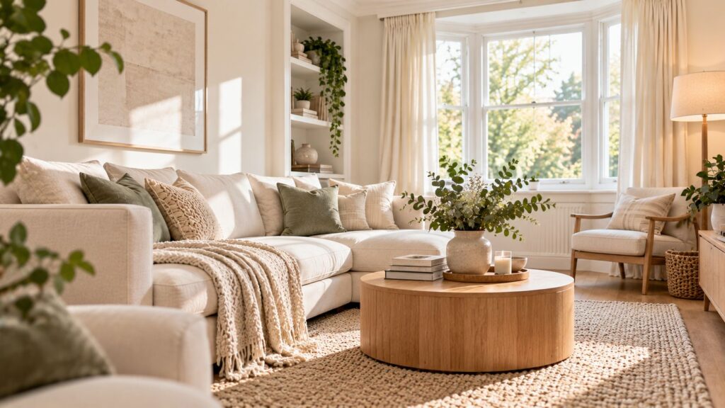
Soft white can create a light, low-contrast base without the sharper look of brilliant white. Consider how the shade sits beside your walls, flooring and timber finishes, as these can affect whether it appears warmer or cooler.
On larger furnishings, soft white can provide a useful foundation. A pale sofa with similarly light curtains can then be balanced with stronger cushion colours. Compare sofa furnishing fabric in the room before committing.
Warm Cream
Warm cream can keep a small living room light while adding more warmth than white, especially where flooring, timber or existing furnishings already have warmer tones.
Use it to create continuity across larger fabric areas without making every item match exactly. Cream curtains, for example, can sit comfortably beside a light neutral sofa, with deeper cushions adding definition. Compare fabric samples in the room before choosing, as undertones can appear different beside surrounding finishes and under changing light.
Light Beige
Light beige can keep larger furniture visually understated while adding more definition than white or cream. It works well as a foundation shade on a sofa, with lighter curtains maintaining continuity and one muted accent colour adding contrast.
Texture can prevent a neutral scheme from feeling flat. If you want to introduce colour without adding pattern, plain cushion fabrics offer a controlled way to bring in a softer accent while keeping the overall palette calm.
Pale Greige
Pale greige blends grey and beige, making it useful where warmer and cooler elements already share the room. It can sit comfortably between cream curtains, neutral upholstery and muted accent colours without pushing the scheme strongly in either direction.
Greige shades vary considerably, especially in their undertones. Compare samples beside flooring, walls and existing furniture before choosing. A fabric described as greige online may look warmer or cooler once viewed in your own lighting.
Soft Grey
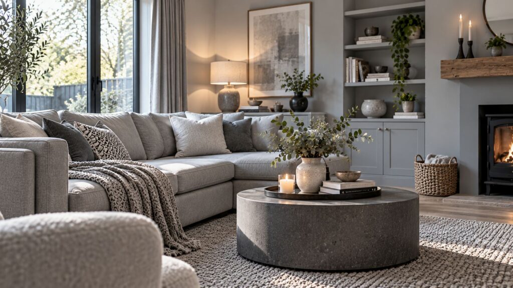
Soft grey can create a light neutral backdrop without the warmth of cream or beige. Its undertone matters, as some greys appear warmer while others look noticeably cooler beside existing finishes.
Curtains can form a large block of colour, making plain curtain fabric a useful option where you want visual continuity. Pair soft-grey curtains with pale upholstery, then use warmer cushions to prevent the scheme from feeling too uniform.
Pale Blue
Pale blue can introduce clear colour while keeping the overall palette light. It works well for readers who want more personality than an entirely neutral scheme.
Use it on cushions, an occasional chair or selected upholstery, then balance it with soft white, cream or another pale neutral. Fabric texture can change how the shade appears, making some blues look softer or deeper than expected. Compare samples in the room before deciding how much pale blue to include.
Light Sage Green
Light sage green introduces muted colour without the stronger contrast of deeper greens. It pairs well with cream, beige and other softened neutrals, making it a good choice for readers who want subtle colour.
Try sage on curtains, cushions or selected upholstery, depending on how prominent you want it to be. As shades vary considerably, compare fabric samples in your room before choosing, since lighting and surrounding finishes can change how the colour appears.
Muted Blush Pink
Muted blush pink can bring gentle warmth to a light scheme while providing an alternative to cream and beige.
For a restrained result, keep it to smaller furnishings such as cushions or an occasional chair. This allows the colour to stand apart from a pale neutral sofa without becoming the dominant feature.
Texture can shift its character considerably. A flat woven fabric may appear quite different from a deeper pile in a similar shade.
Place samples beside the main upholstery and surrounding finishes before deciding how much blush to introduce.
Soft Pastel Shades
Soft pastels can bring several colour families into a small living room while maintaining a relatively light palette, provided the shades relate to one another.
Rather than combining many unrelated pastels, choose one or two accents. A neutral sofa and curtains with pale blue and muted blush cushions, for example, create clearer visual organisation than numerous competing shades.
You can also gain variety through texture. Closely related colours do not need to look flat when their surfaces differ.
Treat pastel accents as part of the overall scheme rather than isolated purchases. Consider what they will sit beside before adding another shade.
Use Colour Across Upholstery, Curtains and Cushions
The largest fabric areas have the strongest visual presence, so start with the sofa and curtains before choosing cushions and smaller accents.
Aim for related tones rather than exact matches. This can create continuity while still giving each furnishing its own role. Pattern adds another visual element, so plain fabrics can help reduce busyness where several surfaces already compete for attention.
Texture also affects how a colour reads. Where samples are available, compare sofa, curtain and cushion fabrics together in the room, alongside the walls, flooring and existing furniture, before making a larger commitment.
Do You Have to Avoid Dark Colours in a Small Living Room?
No. Dark colours can work in a small living room, especially when used as controlled accents rather than across every large surface. The pale shades in this guide support a lighter, more continuous look, not a fixed design rule. If you prefer deeper tones, introduce them through an occasional chair, cushions or another smaller feature. This creates contrast without overwhelming the wider palette. Room size alone should not dictate your choices, and personal style should still shape the final scheme.
Soft white, warm cream, light beige, greige, soft grey, pale blue, sage green and muted pastels can all contribute to a lighter-looking living room. The stronger decision is how those shades work together across the largest fabric areas.
Choose the sofa and curtains with the overall palette in mind, then use cushions and smaller pieces for controlled contrast. Pay attention to undertones and texture rather than relying on colour names alone.
Explore upholstery and soft-furnishing fabrics for your living room, and order samples where available to compare your preferred shades in the space before committing.
Leave a Reply